When was the last time you updated your design portfolio? (If you’re like me, it’s probably been a while.) Maintaining a fresh portfolio is a good way to show off your skills to potential clients and can be helpful when looking back on work for annual contest entries.
If you’ve fallen behind with your portfolio design, or just need a new portfolio in general, this is a great opportunity to create something using trendy techniques and visuals.
A modern portfolio using design trends can make a great impression. A portfolio is also a representation of your skills — so design wisely! Here’s a look at some of our favorite portfolio design trends.
Subtle Animation
A website portfolio is the perfect place to show off some of your design skills. Use a cool technique or trendy element to create just the mood to show your design style and ability. For many designers right now, this includes using subtle animated effects – often with other bold elements – to bring attention to portfolio designs.
Eumray’s portfolio does just that with big, bold typography that explains what they do with a nifty animation with the photo. (A headshot on a portfolio website is another design trend that’s hung on for a long time.)
The use of space here and a black and white color scheme are also trendy elements, making this portfolio seem very in the moment. There are other subtle animations below the scroll that tie everything together beautifully as well.
Show, Don’t Tell
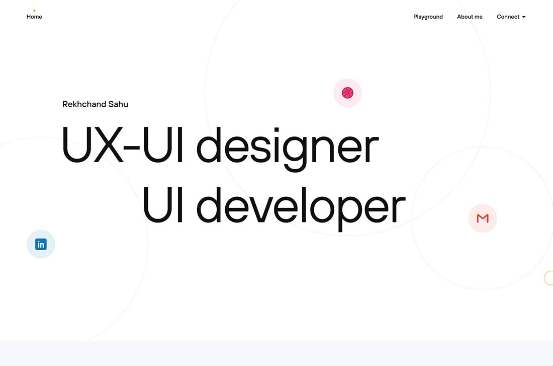
The “show, don’t tell” concept has been a big part of website design for a long time. It can work equally well for portfolio sites, by telling visitors what the design does or where to find information about their work.
Here, Rekhchand Sahu uses bouncing icons to help take you to design elements and information. The overall aesthetic is simple and easy to understand with a clear headline/hero text area.
Click on the icons for more work or scroll for a selection of pieces. The design feels modern and shows the type of style that you’ll get from this designer/developer.
Over-the-Top Design
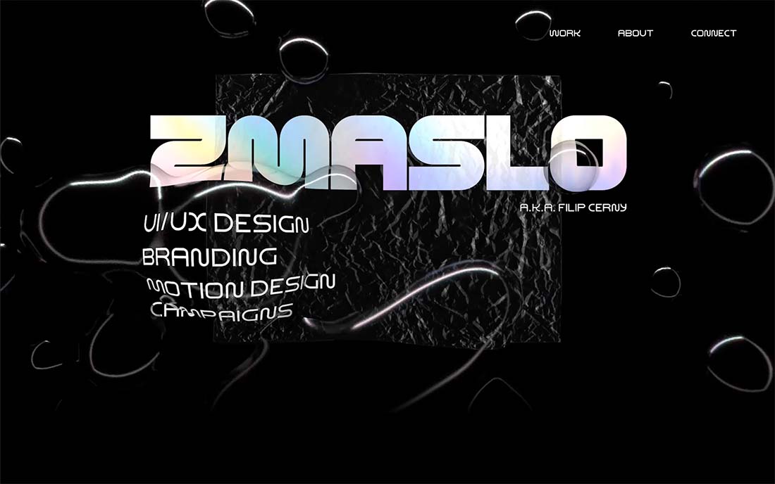
While minimal portfolio styles are popular, over-the-top portfolio designs are beginning to trend. (Likely because they are so disruptive in a sea of black and white, minimal designs.)
This portfolio uses a lot of trending elements together and it works. There’s the big hero headline with a gradient color treatment, liquid animated effects, and funky type elements.
As you scroll, the entire portfolio website has an almost brutalist feel to it with slab font choices and a dark outline. Although the design has a bit of harshness to it, there’s reason to scroll and get into the design and learn more about the designer.
Layered Graphic Elements
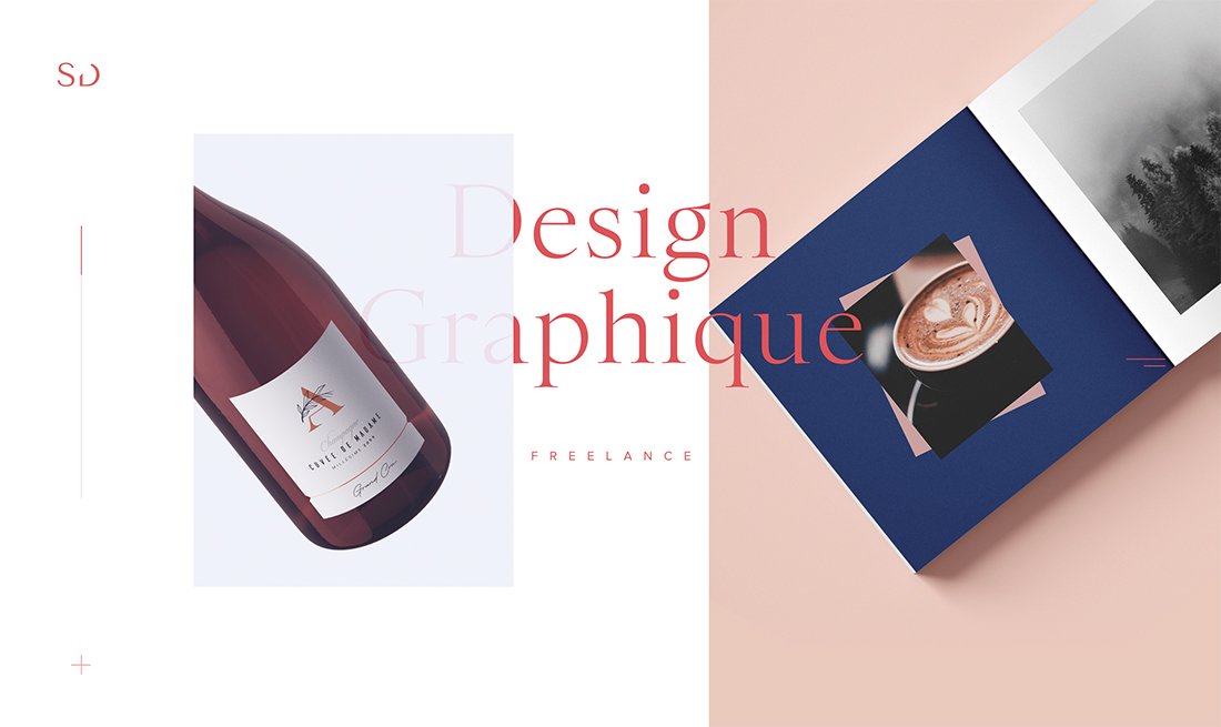
Cool layered effects, especially those that include nifty CSS effects such as parallax scrolling or hints of animation can make for fun layers.
This portfolio technique is gaining popularity and provides a good opportunity for designers to play with certain effects before deploying them on a client project.
This one-page portfolio by Sophie Doukhopelnikoff uses transparencies and text elements in layers that create depth and visual interest. Having letters both behind and in front of images is rather stunning and draws you into the design. Sans serif typography lends and even more classic feel to the overall design.
Subtle Color Effects
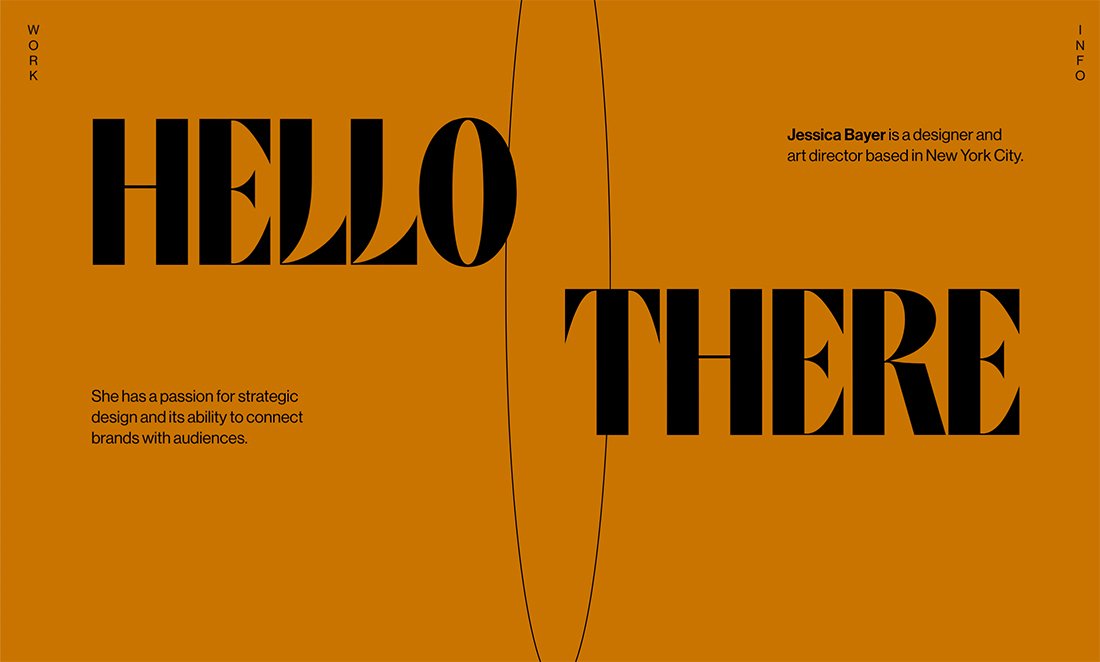
You’re going to have to click through and hangout on this portfolio website for a few minutes to get the full effect of the design.
The simple “Hello There” first expands to fill the screen with other text elements that better explain the portfolio, then the background color softly changes every few seconds for a rainbow effect. It’s simple, subtle, and very beautiful.
This is a color effect that could have a lot of applications elsewhere and speaks to the creative nature of a portfolio website itself.
Super-Simple Aesthetic
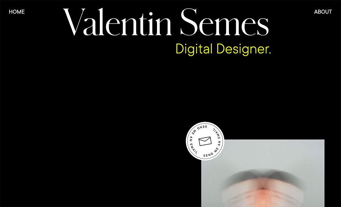
It seems like there’s a trend in portfolio design where designers don’t lead with their work. Their websites are simple and visually interesting and then lead you into their project only after a first glance.
The simple design here is sleek and intriguing. It works equally well with dark or white backgrounds and simple typography and graphic elements.
Valentin Semes makes the most of the super-simple aesthetic with neat interactive divots – pay attention to the mouse hover – to keep you moving through the design so that you see elements of the portfolio.
Magazine-Style Layouts
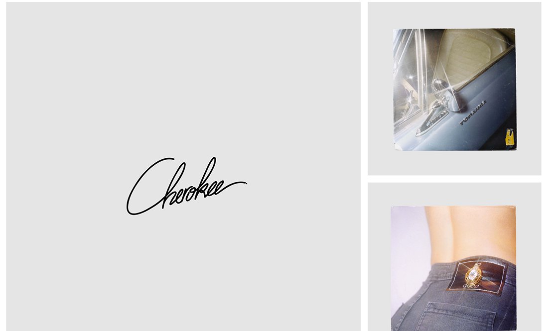
Magazine-style layouts have long been popular for blogs, but can also help show off a portfolio as this trend shows.
Each block can be used to highlight a different type of work or individual project in a way that gives each design room of its own.
Antoine Barres uses this format to show a variety of creative pieces in a way that makes it easy to see each design. The gray background blocks with the white grid have an incredibly classic style that gives each design even more room to shine.
Homepage Bios
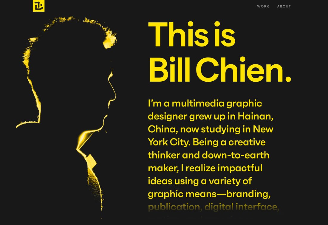
There’s no rule that your bio has to be on the About page of your portfolio website. One of the strongest trends in portfolio design is to move that bio – or at least a short version of it – on the homepage.
It’s a great way to tell people exactly what you do from the start. There will be no guessing what your portfolio is about and what type of creative you are.
It’s a place that you can create a personal statement or even highlight various projects. Bill Chien’s portfolio does this beautifully with a movie-credits style bio that scrolls on the homepage. His bio is simple, to the point, and shows his creative mindset.
Lots of Interactivity
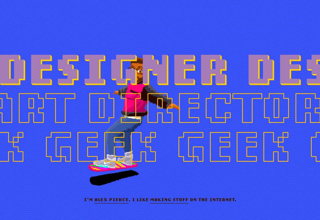
Interactive portfolios are in.
Many of these portfolio designs are visually loud, packed with movement, color, and things to click or cool changing hover states. There’s an almost limitless opportunity to use effects and design techniques.
What’s neat about a highly interactive portfolio is that it provides a place to show off some supreme UX skills.
The challenge is that sometimes the designs can get just a wee bit overwhelming. Make sure to track user behavior and engagement and if you are losing visitors, it might be worth a chance. (It can also be a good test for deploying similar techniques in other projects.)
Unusual Design Patterns
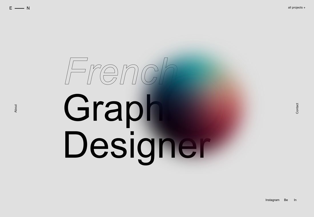
Portfolios that test new design patterns are also trending. Moving traditional navigation elements, obscuring text, and even experimenting with animation states are all common.
This trend might be popular because it provides an opportunity for designers to have a little playground to test techniques and effects. What’s nice about it, is that this trend pushes our idea of what is an isn’t the right way to do something.
The example above uses a few visual trends and unusual patterns at the same time. There’s outline typography that’s partially obscured, an animated hover state for the color orb, and navigation that is on the vertical edges of the screen.
The portfolio trend makes you think about design norms and how you feel about them as you dive in the work.
Black and White
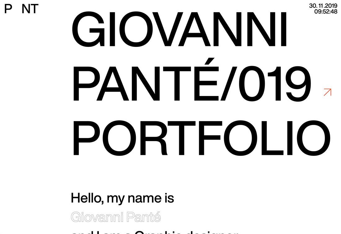
Black and white designs, often with a color accent, are huge right now.
The biggest contributing factor might be that black and white design patterns make it easy to see portfolio works, which are often in color. It gives the thing you want people to see greater attention when it does appear on the screen.
Paired with this black and white trend is another common factor. Portfolio pieces don’t appear on the homepage; users have to click through to find them.
Trendy Typography
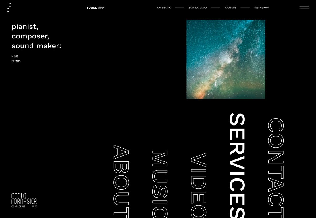
You can never go wrong with amazing typography. Whether you are using a trending type element, such as the outlines above, or simply a beautiful typeface, this trend never gets old.
Strong typography skills will help your portfolio shine and help others understand the quality of your work. This trend shows why creating a portfolio that represents the strength of your skills is important.
Potential employers and clients will often get an impression of the kind of creative you are simply by looking at your portfolio website. Almost every designer would love to be thought of as someone with strong typography skills. Using trendy typography well definitely fits the bill.
High-Performance Effects
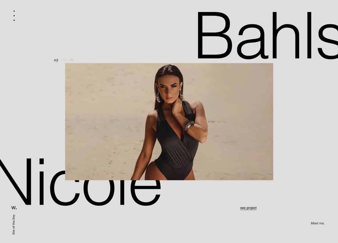
Victor Costa’s portfolio is a prime example of how to create a high-performance portfolio.
Because web designers, photographers, and other creatives are using their portfolios to show off what they can do, there’s a distinct shift to more high-performance designs. (Some of which are too much for mobile displays. Make sure you have an alternative gateway if you go this route.)
These high-performance designs are packed with nifty JavaScript, animation, and effects that are designed to wow users.
Victor Costa’s portfolio is a prime example of how to create a high-performance portfolio. It opens with an option for users – standard or high-performance. The portfolio is filled with interactive elements, fades and scroll actions and animation. These techniques match the elements he references in his bio and is not only a showcase of past work but an indicator of what else he can do for clients.
Plenty of Space
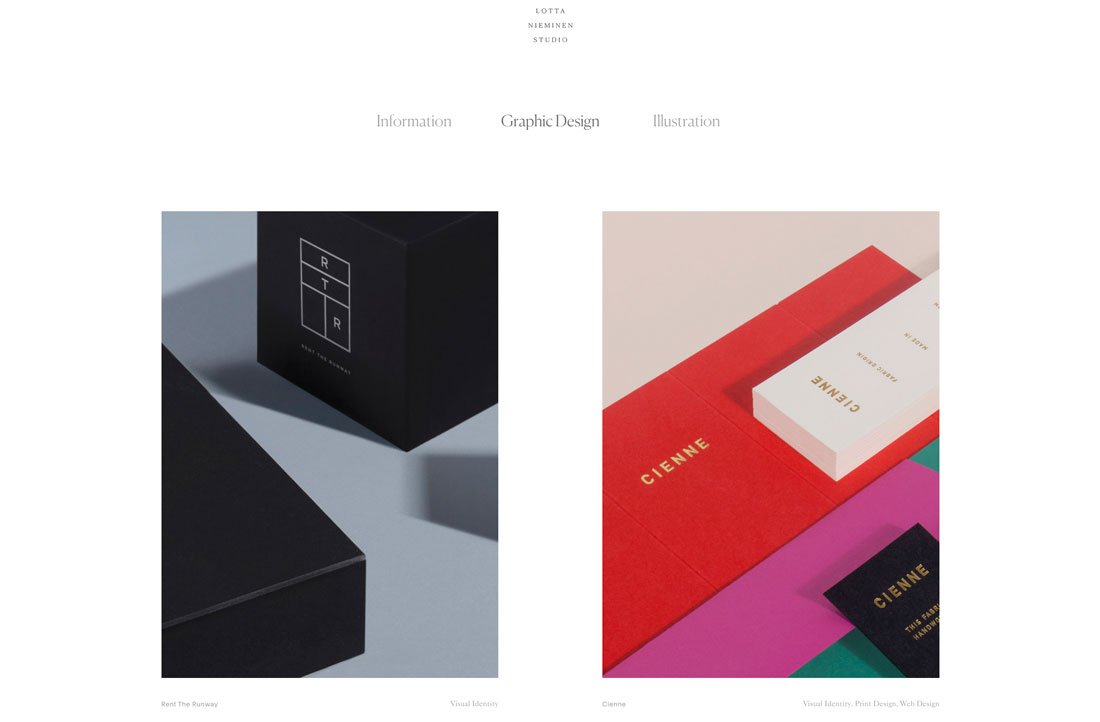
Something that’s been popping up in more designs across the board is making its way into portfolio design as well – plenty of space between elements and objects.
This trend seems to have roots in ensuring that items are appropriately separated on mobile devices and have plenty of tap-space, but the additional space can look great on desktop screens as well. (Granted, I’ve always been a fan of white space.)
Lotta Nieminen’s portfolio is a perfect example of this design in action. The super-deep header takes up more than a third of the screen while the vertical and horizontal space between portfolio images is super wide. Each element stands on its own and the exaggerated spacing gives each project room to stand on its own, which can be particularly nice for a portfolio design with the potential for so many different types of images.
Groovy UI
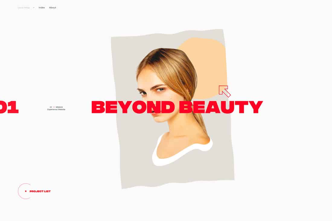
Pairing a minimally-styled design with stylish user interface effects can create quite a stunning portfolio. This combination of visual simplicity and complex interaction can delight users and keep them looking through different screens and portfolio projects.
Click through the example above to see how each portfolio project glides onto the screen with a cool ripple effect before it stops. The cursor shifts and shapes as well, denoting click elements to take users through each project in a way that’s more than just reading about how the design came together.
This is a portfolio you could spend hours with thanks to the groovy UI.
Large Typography
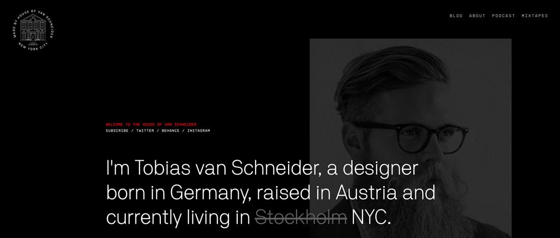
Typography and text are some of the most frequently overlooked design elements when planning a project or portfolio.
Strong typography and language can be the perfect introduction to your work (and portfolio). Most people probably know of Tobias van Schneider from his ventures as a designer or podcaster, but would you expect his portfolio home page to be mostly text?
Typography and text are some of the most frequently overlooked design elements when planning a project or portfolio. Most of us are so concerned with the visuals or animation.
This example shows why so many designers are opting for portfolios that feature strong typography. It sets the right tone – you know what he does and what the site is about – before getting into the deeper visuals. (This option also highlights his strength for designs that feature a lot of text.)
Portfolios That Don’t Look Like Portfolios
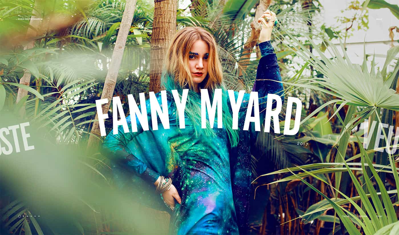
…as a designer you don’t have to come up with something completely new to show off your work
One of the biggest trends in portfolio design is crafting a portfolio that looks like another type of website altogether.
Robin Mastromarino’s portfolio looks like a website for a bar or fashion designer or professional athlete, depending on which part of the slider you view first. It’s beautiful and simple and what’s most impressive is the room each project has to shine.
Subtle cues help users understand elements of the portfolio, such as small numerals above the headline, and the date below. Plus, the slide element that encourages left to right scrolling with partial headlines from other projects.
The other things that are so nice about this portfolio style are that as a designer you don’t have to come up with something completely new to show off your work. With big “art” for projects, completed jobs are the focus, rather than creating something completely new. (How’s that for creating something you can update quickly?)
Split-Screen Patterns
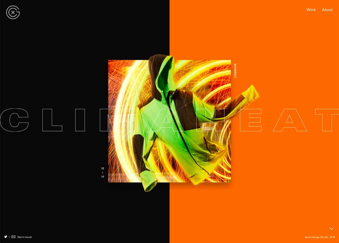
Split-screen patterns have been trending for a while and more portfolios are using this design, even if they don’t use the functionality. It works because the pairing of elements helps drive users across the screen to take in everything in front of them.
Xavier Cusso uses a split-screen design with great parallax scrolling effects to move from project to project. The color-block screen design helps emphasize that the website is his creation, while the element in the middle is the portfolio project to examine. It puts some separation between the portfolio and project designs.
This is a nice way to handle big-name projects – note the graphic for Adidas Climaheat here – while maintaining your identity in the portfolio design. (Make sure to click through and visit individual projects here; the overall portfolio design is impressive.)
Minimalism-Inspired Design
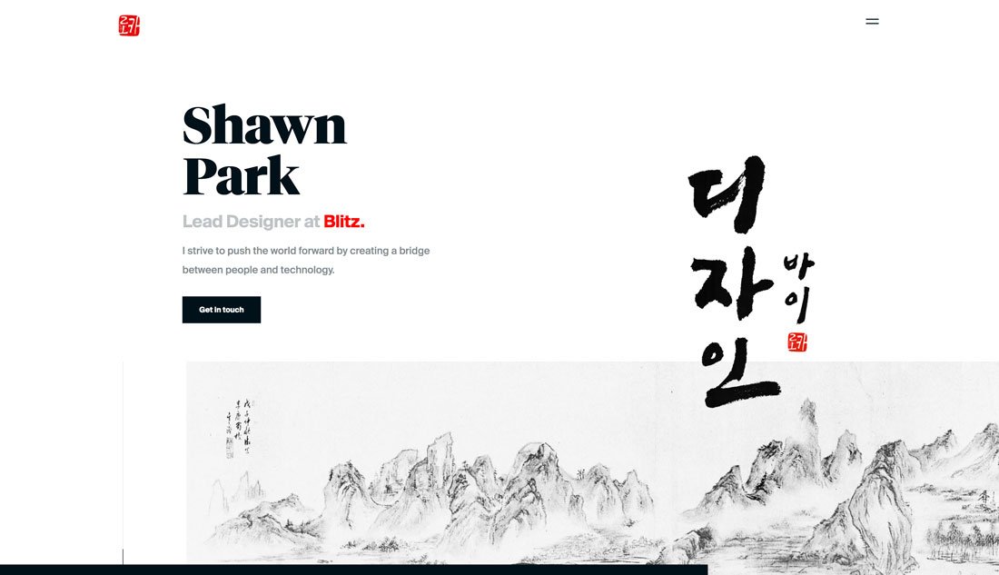
The best thing about a minimalism-inspired portfolio is that it gives the design plenty of room to shine. The design of the actual portfolio becomes relatively invisible so that all the focus is on the elements that you want people to see.
Designer Shawn Park recently wrote about how he redesigns his portfolio every year for UX Collective – I highly recommend that you go read that article here – and the current design (above) shows an evolution of design trends in itself.
Park includes iterations of his portfolio design in the post, beginning in 2013, and you can see how design trends impacted his portfolio. You can also see how this fresh minimal style makes it easier to see his work today than in previous incarnations.
Oversized Homepage Headshots
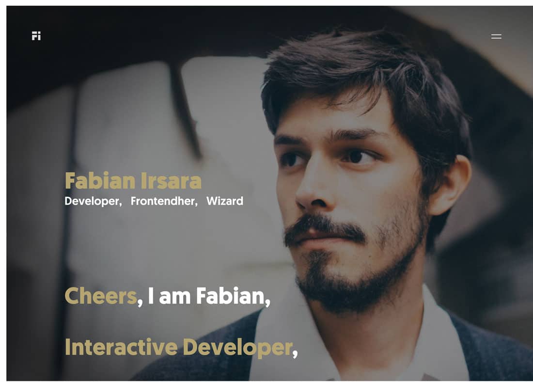
Big headshots are a big deal, particularly with developers and interaction designers.
This portfolio trend might be popular because it’s harder to visually show this work: Do you highlight code?
The trick to making this portfolio design work is a strong image. It needs to be more than a headshot; it needs to have a moodiness to it. Then pair it with strong typography to make it obvious that this is a portfolio website and what you do. Keep all of that information above the scroll for the best chance at keeping visitors moving through the design.
And a few nifty effects can’t hurt either.
Modular Grids
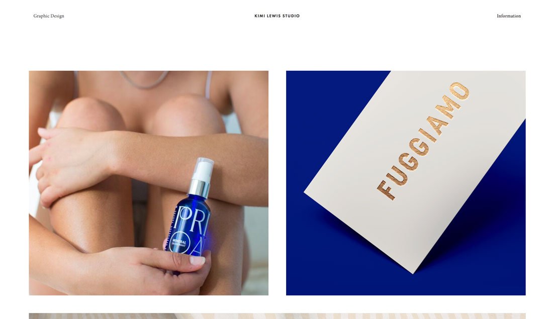
One portfolio design trend that never seems to fade is the use of modular grids to show off projects. This is a great – and functional – option because you can “float” images of different projects on a single canvas.
Kimi Lewis does something a little bit different with her portfolio, above. Rather than lots of small blocks to show portfolio projects, this design goes big. It mixes and matches squarer and long horizontal images in an oversized grid.
Users get a good feel for each project right from the start. Add the oversized grid images to some exaggerated spacing between elements and this portfolio might be one of the easiest to digest that I’ve seen in a while. There’s also a nifty hover animation on each image with the client name and project type to provide extra information before you click through.
Color Overlays
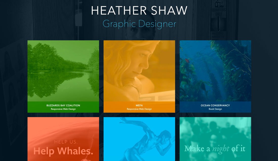
Heather Shaw’s portfolio works because each project is so different, but the color overlays give the homepage a connected feel.
One of the most challenging things about creating a portfolio is the homepage. How do you preview work or project sections in a way that will entice users to actually click through?
The answer might be to partially obscure the work. Using interesting color overlays on preview image links can be a visually engaging way to encourage clicks to individual projects. It’ll keep your homepage cleaner with a consistent look and style for different sections of the website, ensure that one page isn’t too heavy and slow to load, and provides an opportunity to highlight something about a project before the click.
Heather Shaw’s portfolio, above, works because each project is so different, but the color overlays give the homepage a connected feel. The user also knows what kind of project they are about to view thanks to labels with client names and project type right there. This is a highly navigable and easy to understand format that appeals visually.
Streamlined Project Showcase
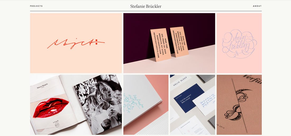
And then there’s the opposite end of the spectrum – portfolios that have a more streamlined look and feel. There can be a benefit to only showing a handful of projects.
It ensures that users only see what you want them to focus on and not get distracted.
Stefanie Bruckler also uses a module grid format but with fewer items in a more contained space. Plus, it’s all below the main scroll which features a minimal business card style design.
It has a look that’s polished and classy, setting a distinct tone for the work of this designer.
Conclusion
Still not quite ready to redesign your portfolio? While it is a creative project, this is also an investment in your business, whether you work for a company or as a freelancer.
Potential clients are looking for you before you even know they exist. A modern, trendy portfolio with your best projects can make a strong first impression.
