Our series of tips on presentation design outlined some generic rules and ideas that you can live by to create better, more professional presentations. Today we want to follow that up by taking you through the actual process of designing a presentation from start to finish.
We’ll break down every step of the design process, from choosing colors and images to using whitespace properly. After reading through this you should be all set to design your own beautiful presentation slides that will put your coworkers to shame.
Using a pre-built PowerPoint template can be a good starting point for many people (we collected some of the best PowerPoint templates for you!). But if you’re wanting to design your own from start-to-finish, you’re in the right place!
Word About Content
I usually make a big deal about content preceding design, and presentations are no exception. Ideally, you’ll have the topic and much or all of the content outlined before you even think about design. This will in every way shape the appearance of your design, which is why working from pre-built templates isn’t always the best move (though generic templates can and do work great in some circumstances).
The reason that I bring this up is that I don’t really have an actual presentation in mind for this project. I’ll be running with a basic theme, but the textual information will be entirely placeholder copy. Your image, font, color and layout selection shouldn’t necessarily match mine but instead reflect the topic and content you’re working with.
Choosing A Color Scheme
Before I even open Photoshop (yes, I design PowerPoint/Keynote slides in Photoshop and drop them in), I want to find a color scheme on which to base my entire design. When I need to quickly find several colors that go together I usually start with Adobe Color CC. Not only is it a great way to build your own color schemes, it’s an outstanding source to find schemes built by others that you can just grab for your projects.
As luck would have it, I liked the very first color scheme I saw upon opening Color. This scheme was featured on the home page and looked like a great place to start for our presentation design.

Now, if you wanted to get everything exactly right, you could make a list of the RGB or Hex values, but I prefer a quicker, more direct route. What I usually do is snap a screenshot of the color scheme, paste it into my document and stretch it across the canvas on its own layer for easy access. This way I can quickly activate the layer, eyedropper the color I want, then hide the layer and get back to work. It’s a bit like having a palette of colors to dip your paintbrush in.
Designing Your Cover Slide
Now that we have a color scheme, the design work is going to be much simpler. One trick that designers often use in presentations is to leverage the color scheme as heavily as possible. If you’re new to design, you’ll likely think that this is too easy, too plain or even that it’s cheating somehow, but trust me, it’ll be much more attractive and professional than that horrid Microsoft clipart library you love so much.
To start, simply grab one of your colors from the scheme you chose and flood the background of your slide with it (I chose #631c25). Good job, there’s your background. Don’t freak out. It’ll look great. Now let’s throw in some typography.
Choosing a Font
Font choice is a major issue for non-designers. The tendency is to think that most fonts are “boring” and to look around for something exciting and fun. This inevitably leads to the use of Comic Sans or some other equally hideous font.
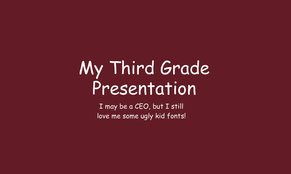
Unless you’re an elementary school teacher, your presentations should never look like this. Instead, why don’t you try one of those “boring” fonts to see if you can come up with something you like.
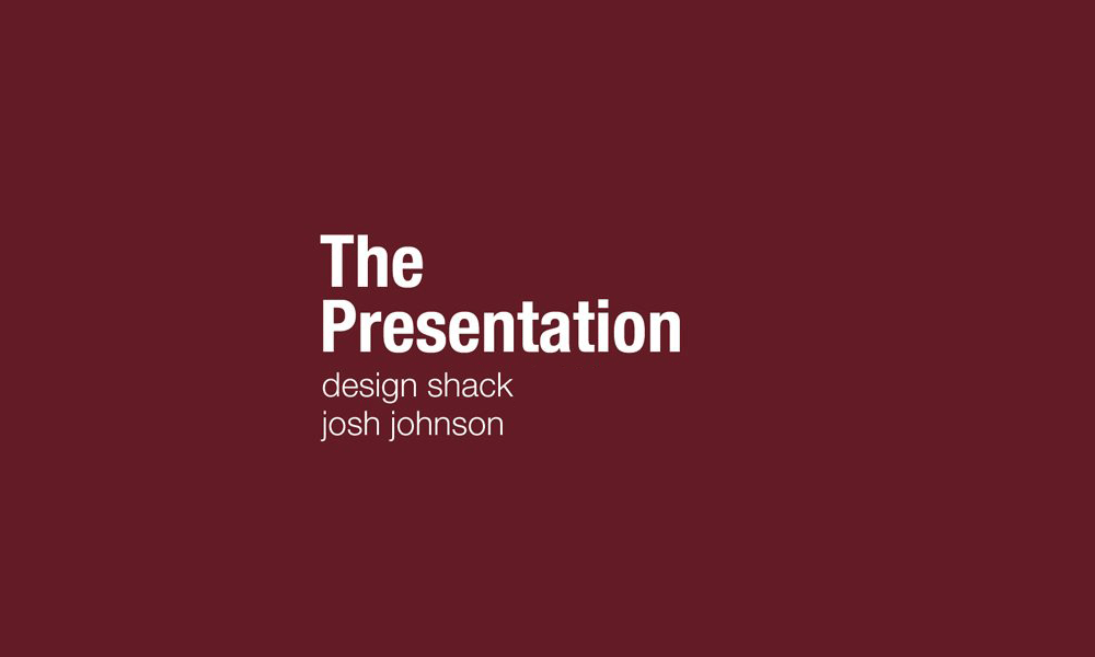
Combining fonts can be a tricky task and can take a trained eye to pull off. Fortunately, font designers have already created collections that work well together and if you’re not a designer, they make it easy to pull off great typography. The trick is to just stay in a family. Again, I know this sounds lame, but it works really well if you make sure the two styles you choose are very different.
For instance, I chose a Helvetica Bold Condensed and a Helvetica Light for my cover slide. Notice how different the fonts are from each other in terms of thickness. Choosing two styles that are relatively close causes visual confusion and should be avoided as a general rule of thumb. Instead, what you want is contrast and plenty of it.
lignment and Layout
Notice a few things about the way I set up this slide. First, I used a strong left alignment for the text. As I say in just about every design article I write, center alignment should be a last resort, not a first. It tends to be the weakest text alignment that you can choose, having a hard edge increases readability considerably (notice that book pages aren’t center-aligned).
Also, notice the generous whitespace that I used. Remember that you don’t have to eat up every inch of space. Giving your text room to breathe helps your layout immensely and gives the design a clean look.
dding an Image
At this point you might be wondering why you wasted your time reading so I could give you such plain advice. The truth is, most people that create presentations could improve them by 100% from following the advice above. However, I realize minimalism may be too extreme for some folks so let’s throw in an image to make it look nice.
Since our text is on the left, I wanted to find something a little heavy on the right. The general theme that I’ll go for is “City photos” assuming I had some sort of architecture or city-centric presentation to give. Again, you’ll have to choose iamges relevant to your own topic.
I grabbed this Flickr Creative Commons image from photographer Ben Spreng.

Now, if we just made this image our background, the text would become unreadable and we would be ditching our color scheme. What we’re going to do instead is set it on top of the colored slide and set our blending mode to Overlay. Then throw your opacity to around 45%.

As you can see, this helps the slide look much more interesting but keeps the text and colors fairly intact. It’s a simple solution that adds a lot of interest to an otherwise plain design.
dding Content Slides
The cover may seem like it’s only a tiny part of the battle, but you’ve actually already set the tone for the entire presentation. You’ve got your theme, color scheme and fonts already in place. Now you just need to set up a few different layouts for your content.
The thing to keep in mind is to keep everything extremely simple, and that includes the level of content that you include. Apart from design, these are just good presentation tactics that you’ll learn in every public speaking class. Filling your slides with everything you’re going to say makes you unnecessary. You could just email everyone the slides and shut up.
Instead, the slides are merely meant to be a visual aid. Show a slide with your overall topic or main point, then speak the rest, without reading. Nothing is worse than watching a guy read his note cards word-for-word for thirty minutes, except perhaps watching a guy turn his back to the audience so he can actually read his slides out loud to you the whole time! You may laugh, but I’ve seen it happen folks.
For our first content slide, we’ll grab another Flickr photo and set it to the bottom portion of our slide at full bleed. Then we’ll set the top to another color from our scheme and toss in some text using the same exact formatting that we used on the cover.
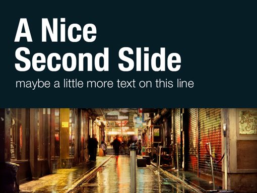
See how this closely resembles the theme we’ve already established while still looking significantly different? This is they key to good presentation design: cohesiveness without redundancy.
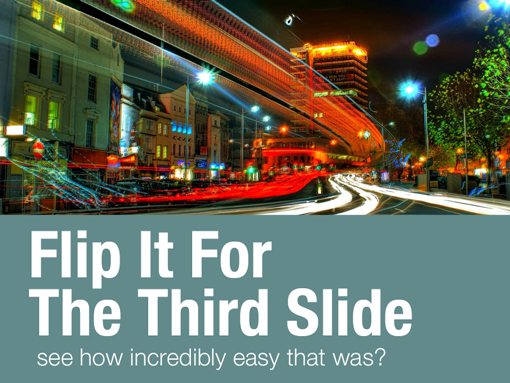
Now for our third slide, we can simply do the inverse of the second slide with a new color and a new image.
dding Informational Elements
It would be nice if every slide ever presented could work in a full bleed image, but the truth is that this simply isn’t practical. It will often be the case that you’re presenting graphical information or some other item that isn’t necessarily a photo.
My advice here is to try to stick as close to your theme as possible. For the slide below I flooded the entire background with a solid color from our original scheme and made a quick 3D graph with white columns (I drew a few flat boxes in Illustrator and applied a 3D effect).
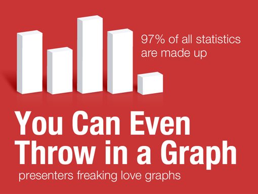
As you can see, this slide is very information-focused and yet it doesn’t sacrifice the aesthetics and simplicity we’ve already established.
You’re All Set
From here you might come up with one or two more alternate slide designs and then rotate between them for the duration of your speech. The result is a presentation that is beautiful, very readable and highly professional. The bonus is that the simple, straightforward design will probably result in less work than a clip-art-filled horror show.
Most of the time, great design doesn’t mean being particularly artistic or knowing how to create amazing complex layouts. Instead, it’s about presenting information in an attractive and user-friendly way. With this goal in mind you realize that you’re probably trying way too hard if your end result is ugly. Try cutting out half or more of the elements on one of your slides and giving what’s left a strong left or right alignment with plenty of whitespace.
Conclusion
I hope this article has convinced you to abandon that clip art gallery once and for all. The benefits of clean, minimal design in presentations are clear: the information is easier to take in and the end result is more professional than the mess of information you typically see in presentation slides.
Of course, if you’re looking to get started quickly, flick through our collection of the best PowerPoint templates to find a beautiful set of pre-made designs!
Did you miss our previous article…
https://www.tampawebdesign.org/?p=408
